2026-02-25
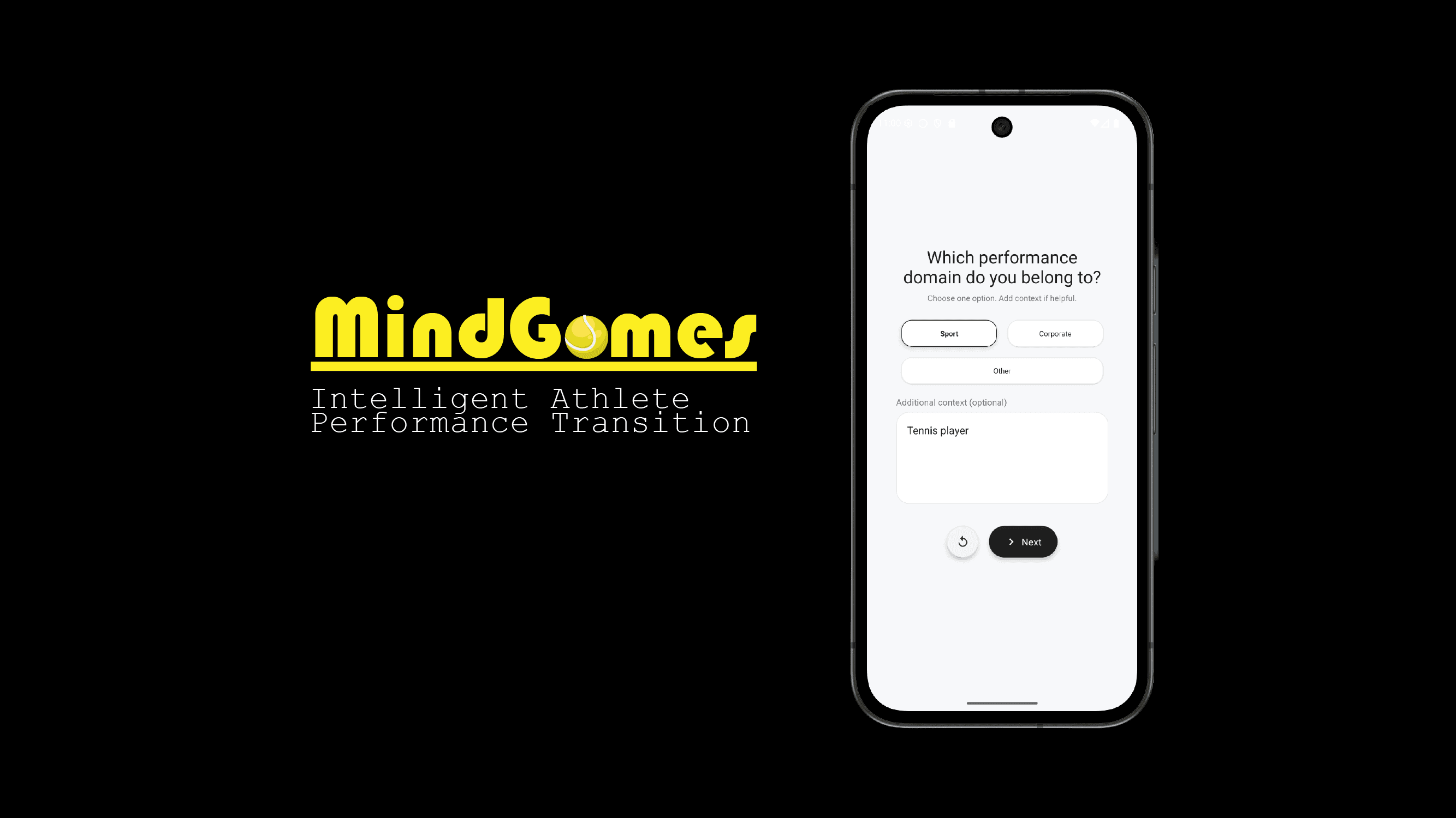
MindGames: Athletic Performance Transition App
Worked as a Technical Cofounder to design and build App
Planning Stage
Before trying to develop this app we had an idea about bringing technology to the world of athelete transition with the help of behaviroal improvement. We experimented by started with survey forms to building a AI based behaviroal detection. After rigorous risk and market study we wanted to build something which tailor to the use of high performance domain like athletes or corporate leaders where each decision is virtal. So how can we use tech to transition better? Maybe it is better at scaling and flexible way to store and analyze data.
App Design
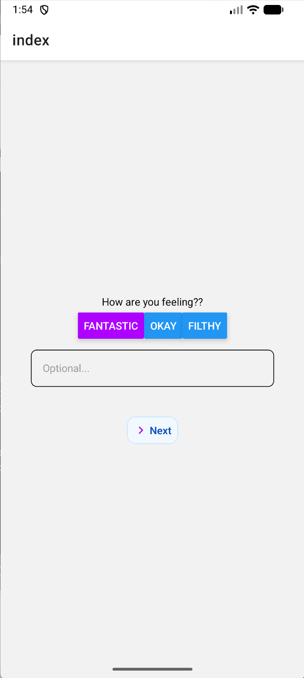
While developing first version of the app I wanted to make it very flexible and reusable components so the questions and answer options can be changed with a few click of a button. As we had an idea about making a dynamic questions to be rendered instead of creating file routes for each pages. I choose to use React Native to develop cross platform app with Expo to use useful SDK and libraries to access hardware and integrate Database.
UI
As every app need a great logo why not add some transition! I used AfterEffects to create motion graphics on a logo vectors and create a transition for making the loading screen more alive. The choice of the logo is kept very minimal due to avoid friction from the user side as a supplemental application. Colors are chosen black to make it distinguishable from the background.

Development Stage
The UI has a dynamic component for the screen instead of moving between pages index. So questions are created as a structure of graph where each current pointer moves between different nodes after the submit button or choices selected. So The screen is fixed and the questions are dynamically rendered with each choices are selected and there is a slide transiton while moving between pages to show the effect for continuity.
Observed Improvement possibility
- Smoother loading and transition for logo animation.
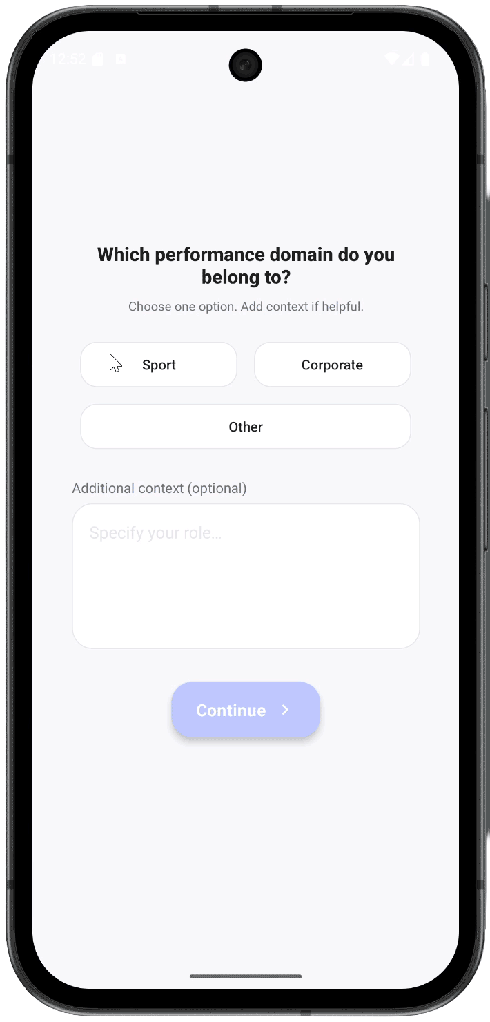
- Fix button layout for simple and uniform look and bold look.
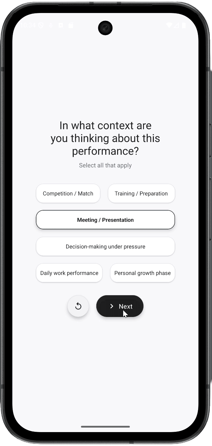
- Button position in close to choices for better UX after selecting options.
- Chose better font topography to make Questions more prominent in the screen and light font weight as user feell sense of calm.
- Added shadow and border to match the button color and make the selected choices more prominent.
- Fix the elevation bug on the submit button as it is showing rectangular block on the button while clicking.
- Add reset button on each page to start over the questions
More Development
Due to the more stale look of pervious interface of the app decided to make it more prominent to the user and nicer to use. Now Added reset button icon for nicer look rather than putting more text button on the page. Added the shadows on the choices for more of a pill look which can be pressed. Changed the text to next instead of continue as it is more shorter to read and better user action to be taken and less friction for the action and moving the icon to the left of the text as the eye first goes to the arrow then the text so more of a sequencial image to text read for the user which feels nicer.